Three Fabric Pulls, One Quilt Pattern
See how three fabric pulls can give the same quilt pattern three different looks, plus get practical tips for choosing colors, prints, and contrast so you love every quilt you create!
One of my favorite things about choosing fabric for a quilt is seeing how much the colors, themes, and prints can change the finished design. The same quilt pattern can feel bright and playful, soft and traditional, or bold and modern depending on the fabrics you select.
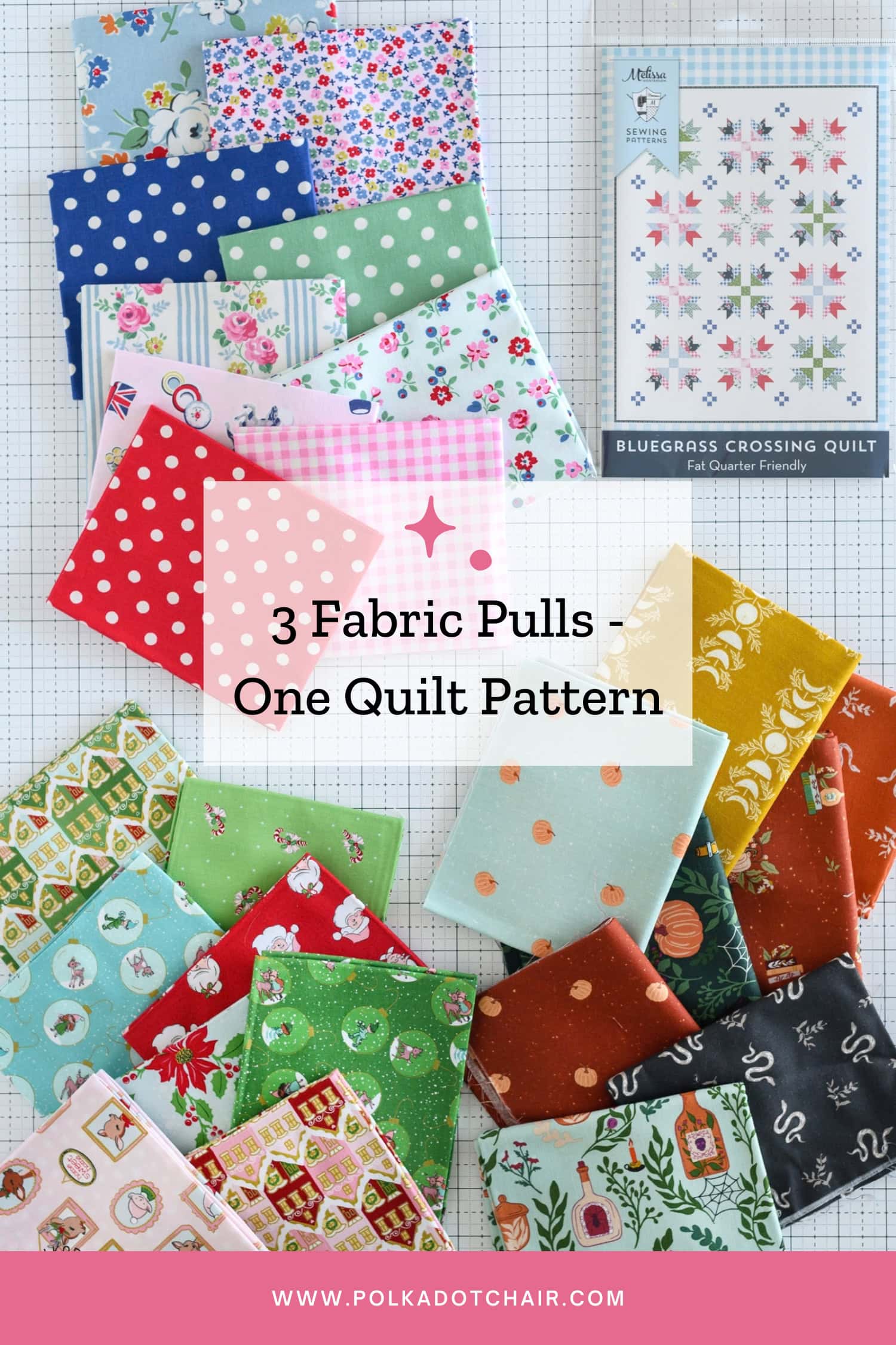
To show you just how different one pattern can look, I put together three fabric pulls for the same quilt design, my Bluegrass Crossing Quilt. We’ll compare the colors, contrast, and print scale in each option, along with a few tips for choosing fabric for your next quilt.
The Pattern: Bluegrass Crossing Quilt
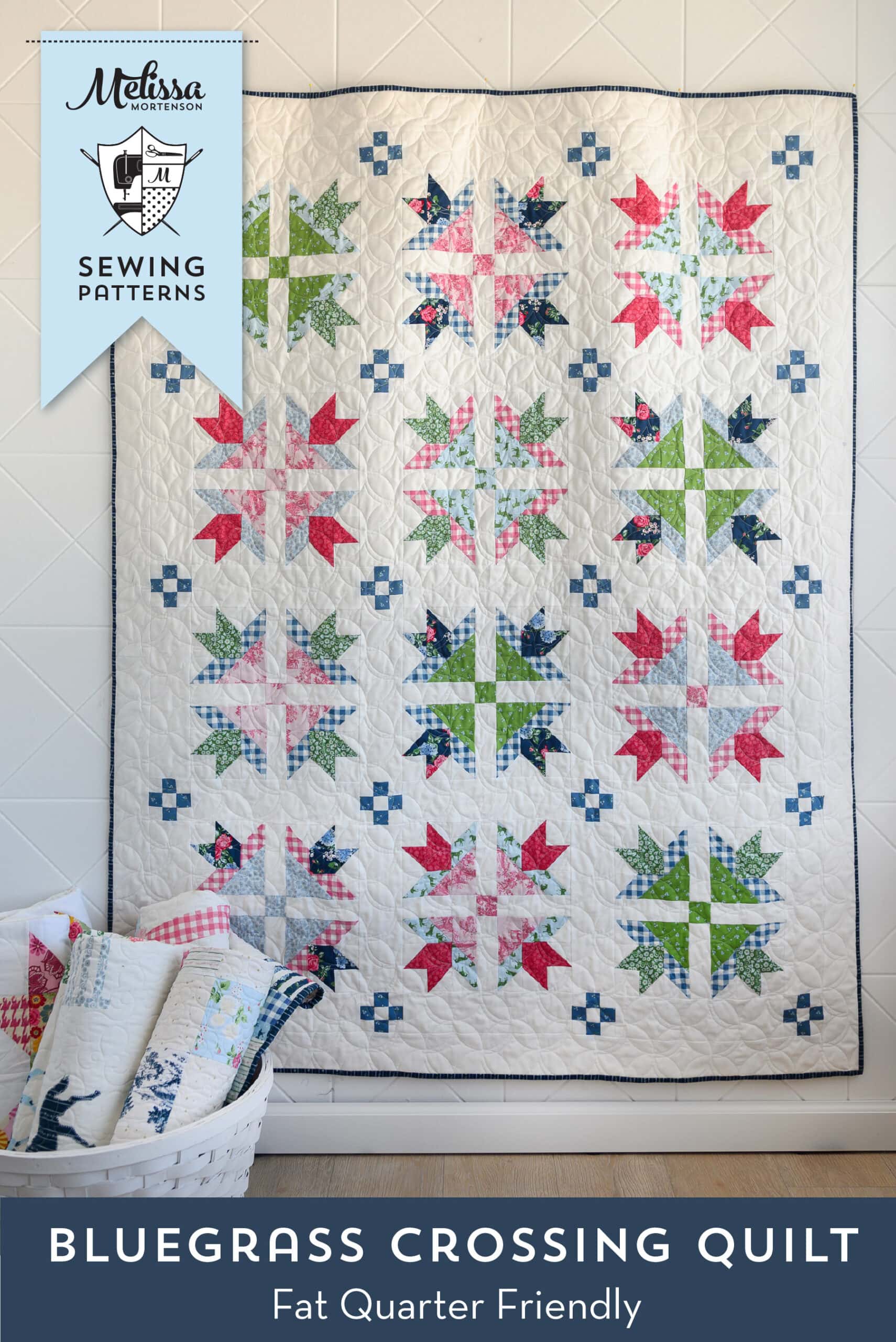
I designed the Bluegrass Crossing quilt to complement my Bluegrass Charm fabric line. I chose the “fresh traditional” fabric collection because it includes traditional elements in fresh, modern colors.
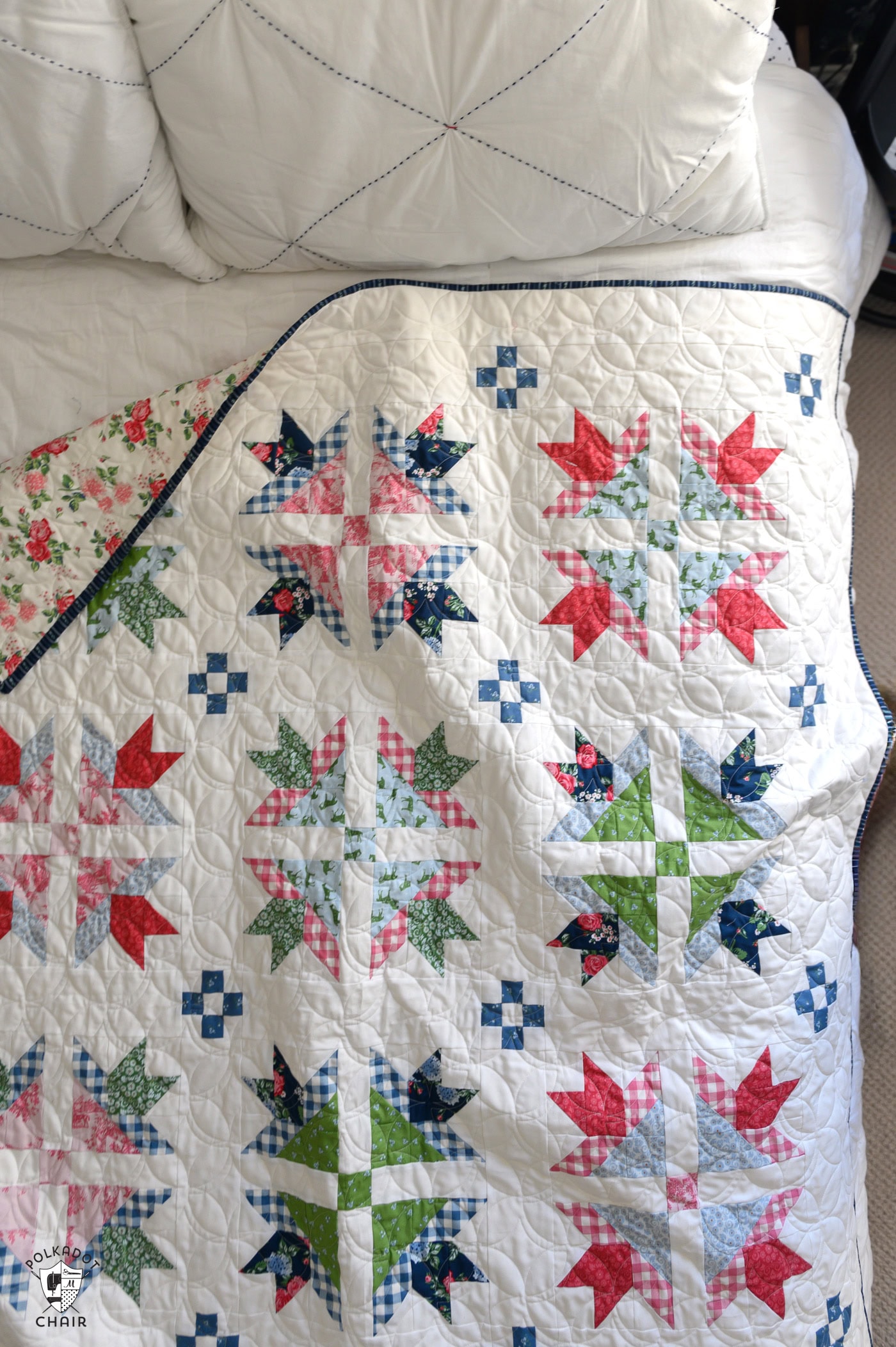
The pattern uses a series of nine patch and goose-tracks quilt blocks, both of which are considered very traditional. Mixing the quilt pattern with the Bluegrass Charm collection gave the pattern a traditional “but updated” feel.
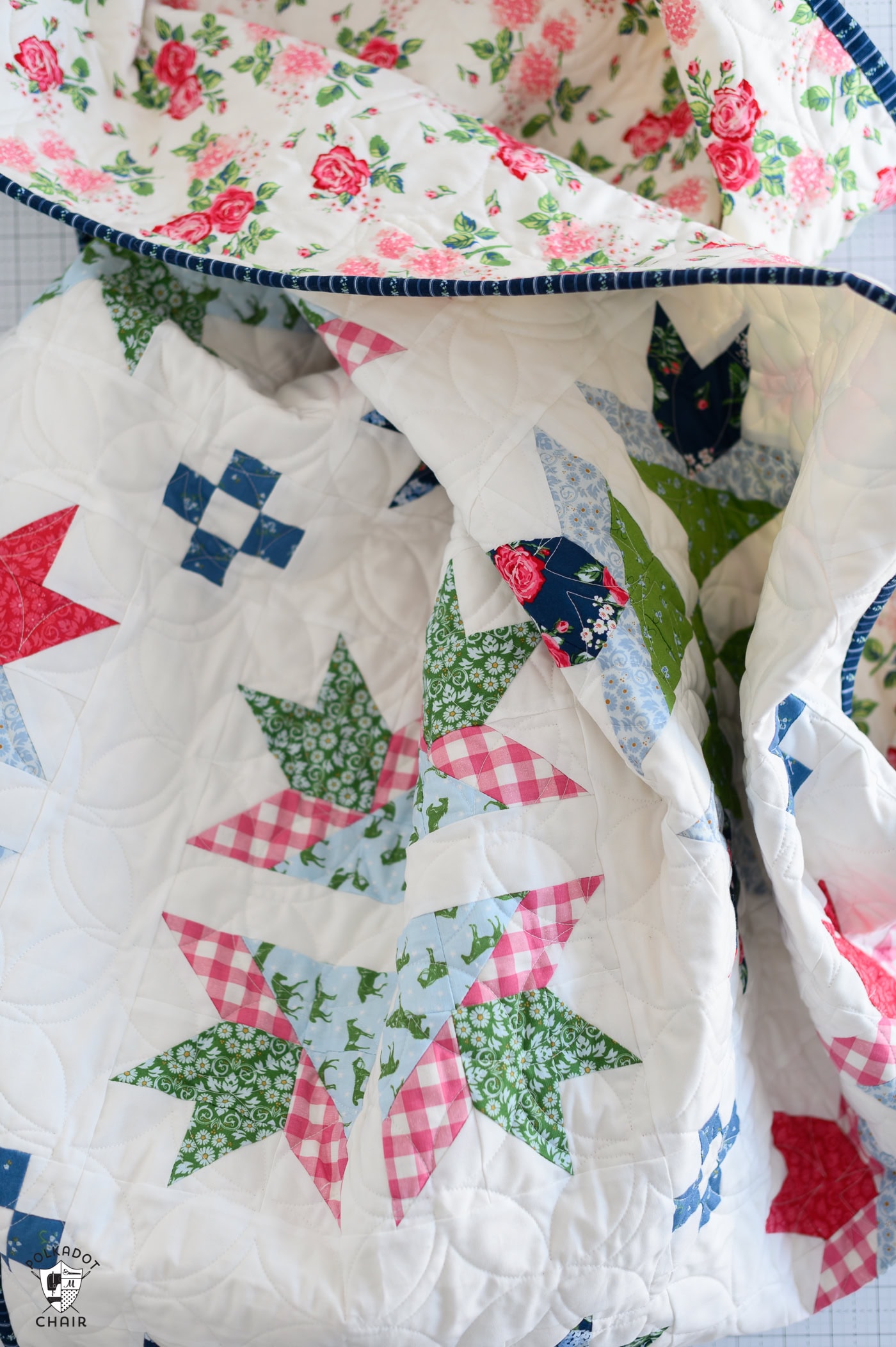
Since this is a Fat Quarter Friendly pattern, it’s easy to swap out the colors and patterns! Just pull a few of your favorite fat quarters for an entirely different look and feel!
A quick note about the digital mockups: they don’t always show the direction of each fabric print. Directional prints may be rotated in the finished quilt, so the final project may vary slightly from the mockup.
Fabric Pull 1: The Apothecary by Riley Blake Designs
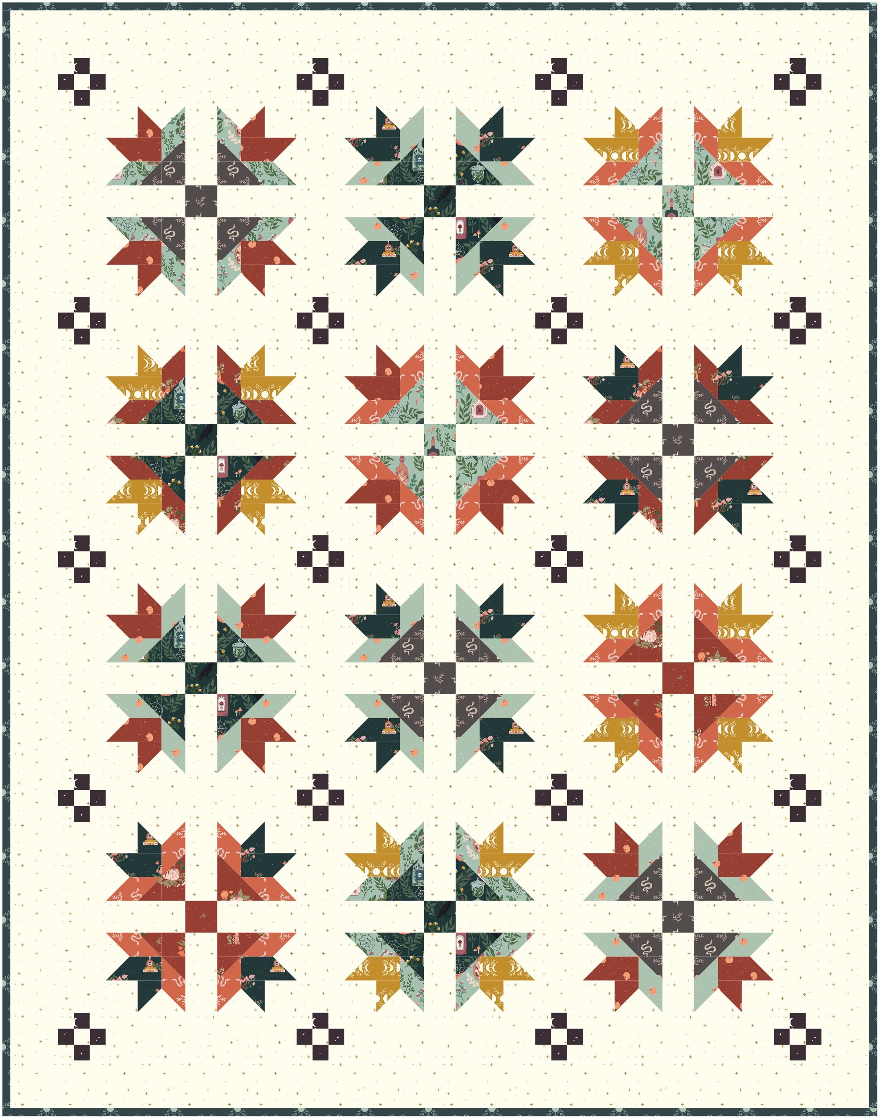
If you’ve been a long-time reader, then you know I LOVE Halloween and have sewn quite a few Halloween quilts. I think I might have a Halloween quilt for each day of October!
Riley Blake released the Apothecary collection by Amber Elliot this year, and I thought it would be fun to mock it up with the Bluegrass Crossing collection.
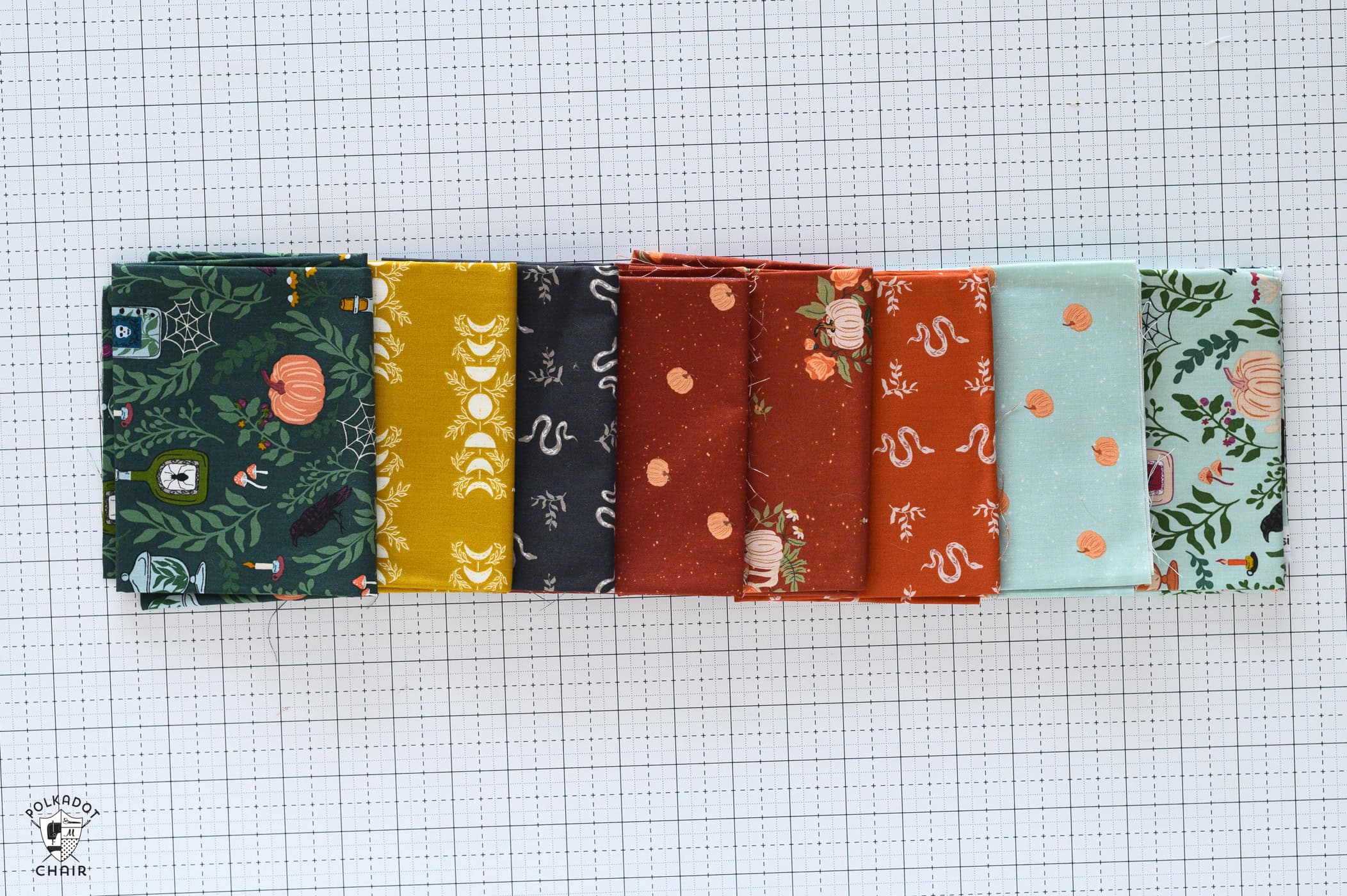
A few things to keep in mind as you decide the fabrics for this quilt.
Try placing the darker/higher-contrast fabrics as the “points” of the Goose Tracks Blocks.
For the interior portions of the block, you can choose a contrasting or analogous color scheme; just make sure the two fabrics aren’t too close in value, or the center section may look like it’s all the same fabric.
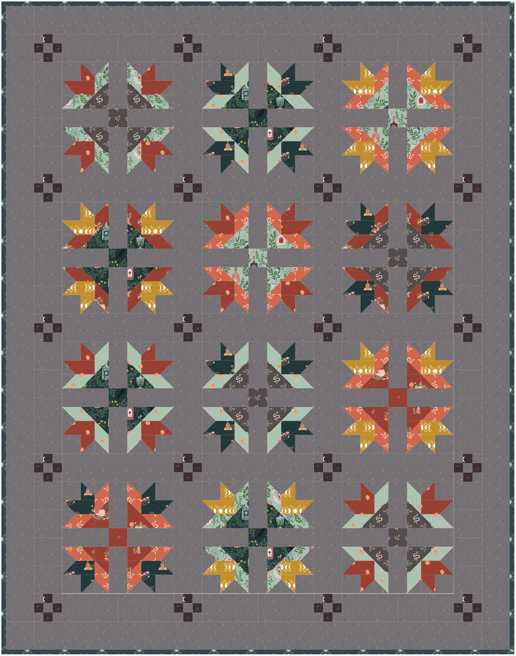
I’ve included two versions of the quilt, both with the same block fabrics but with different background fabrics. One version features Sparkler Fabric in Iron and the other features Sparkler Fabric in Vintage White.
You can see how the background fabric changes the quilt’s look and feel. One feels “moody and spooky,” while the other nods to a vintage quilt.
Fabric Pull 2: Cath Kidston Signature Fabrics
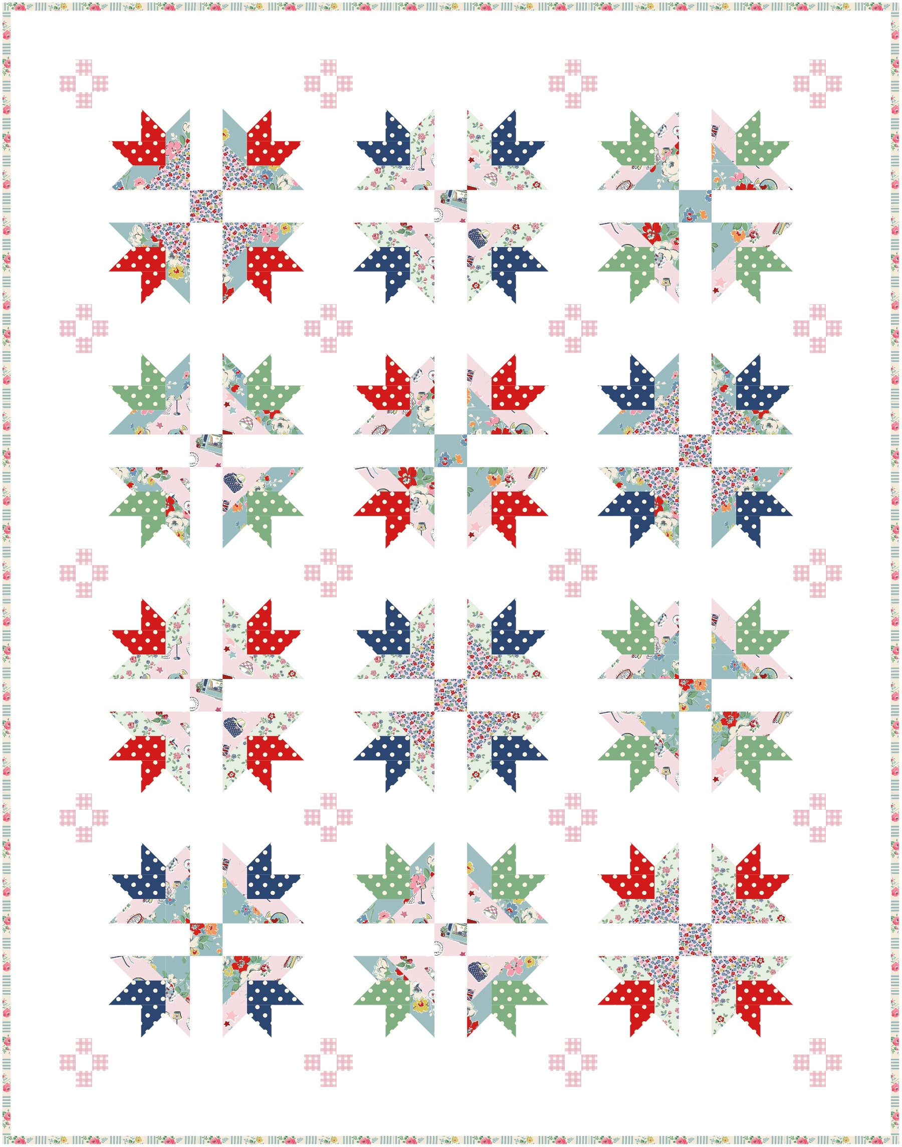
For this fabric pull, I made the iconic Cath Kidston (from the Cath Kidston Signature Collection) polka dot the star of the show and used it on all the points of the blocks. I then filled in the rest of the blocks with both aqua and pink, but mostly kept the lighter fabrics in the centers of the blocks.
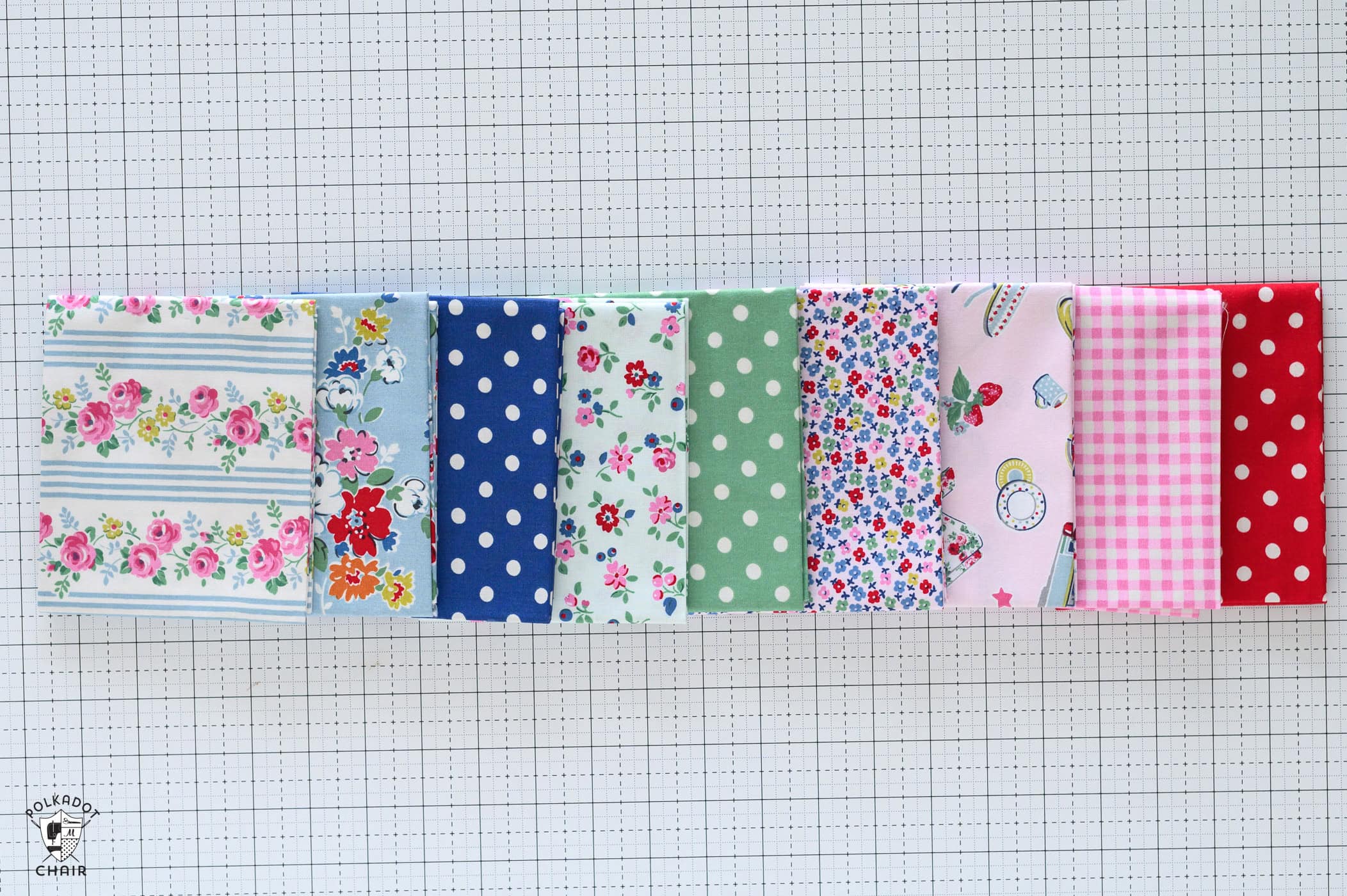
I also chose to put the busier small floral in the center of the blocks rather than on the perimeter since this helps to ground the block a bit.
For the nine-patch portions of the quilt, I wanted it to be “quieter,” so I chose the pink gingham. It gives the quilt texture without being distracting.
Fabric Pull 3: Claus & Co. Fabrics
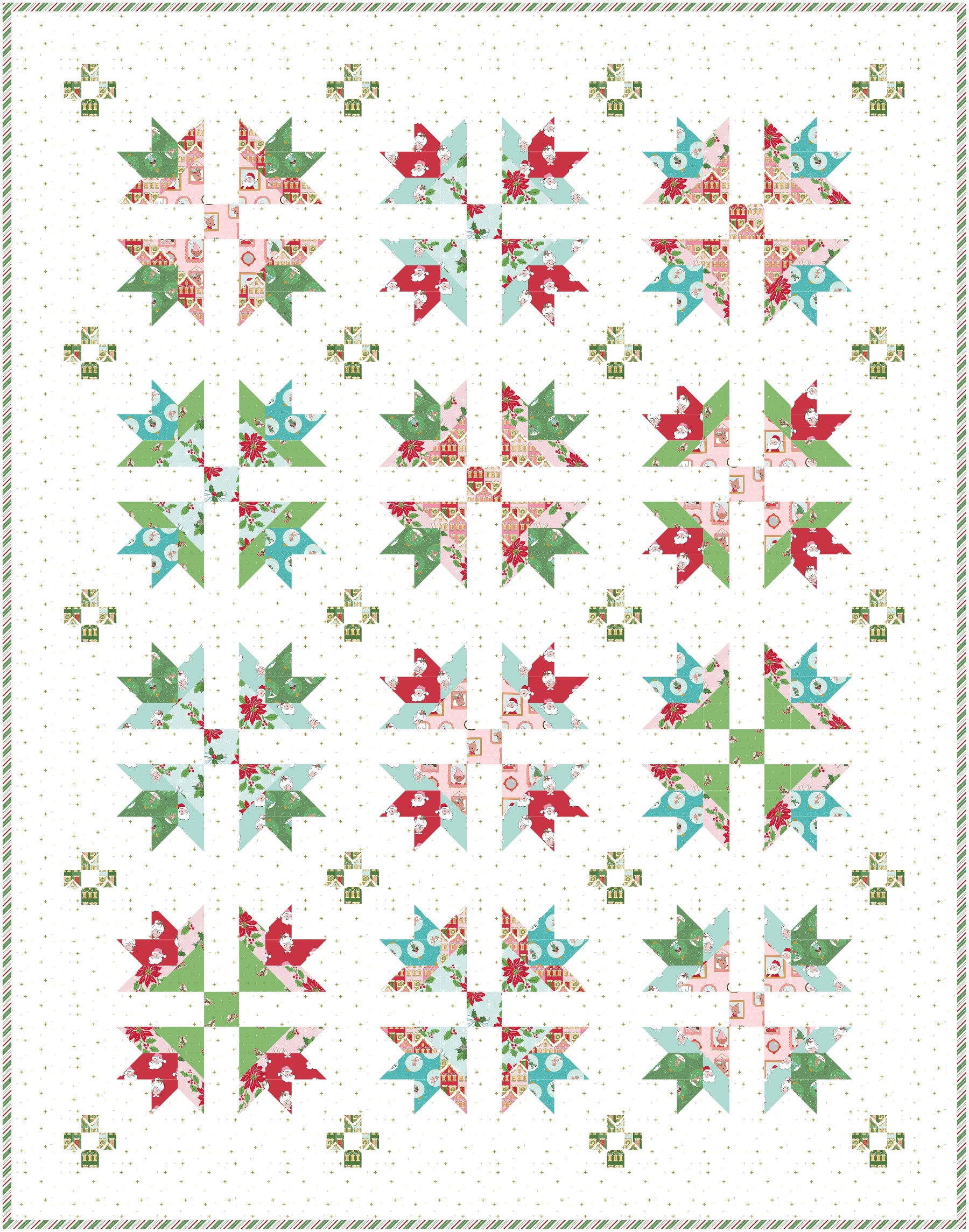
For the mockup with Claus and Co. fabrics, my fabric pull includes a little of each print in the line.
Since this is a bright, cheerful Christmas collection, I leaned into it with the quilt mockup.
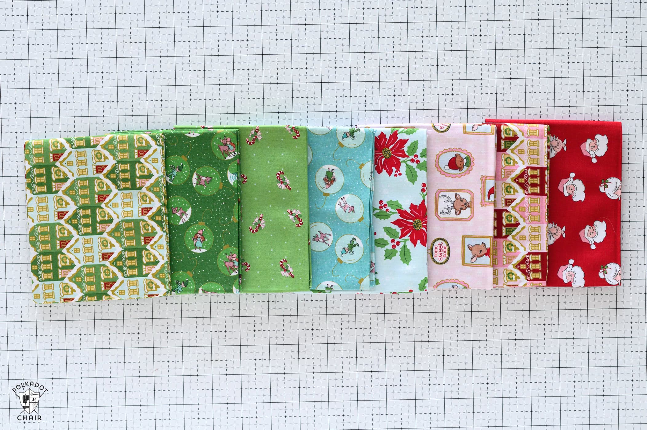
It features White Sparkle for texture and shine, and I again kept the darker fabrics for the points of the blocks.
For the interior of the blocks, I focused on contrast and tried to balance it so there were no repeats of prints or colors inside the blocks.
I want a bit more contrast for the nine-patch portions of the block, so I chose the green houses print for those, since it will look like tiny houses peeking out of the quilt when the fabric is cut and sewn back together.
These three fabric pulls show how many possibilities can come from a single quilt pattern. Changing the color palette, background fabric, or print scale can give the design an entirely different look without changing the quilt’s construction.
Use these combinations as inspiration, or start with a favorite fabric from your own collection and build a pull around it.
Which of the three fabric options would you choose?