We love to sew and quilt as much as you do! Look for new projects posted every week.
Get the latest in your inbox!
Get the latest in your inbox!
Browse By Category
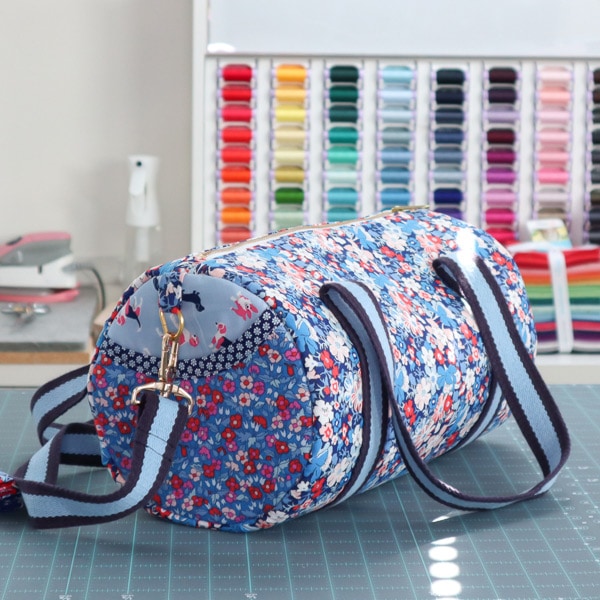
Reader Favorites

Shop our Faves
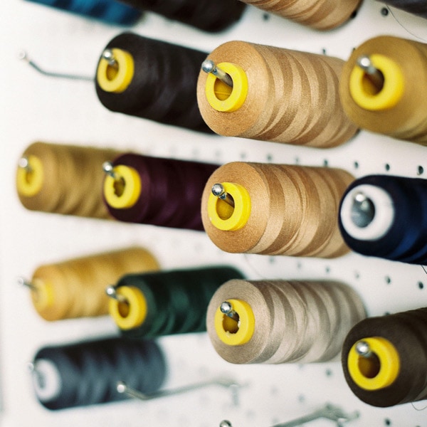
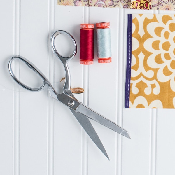
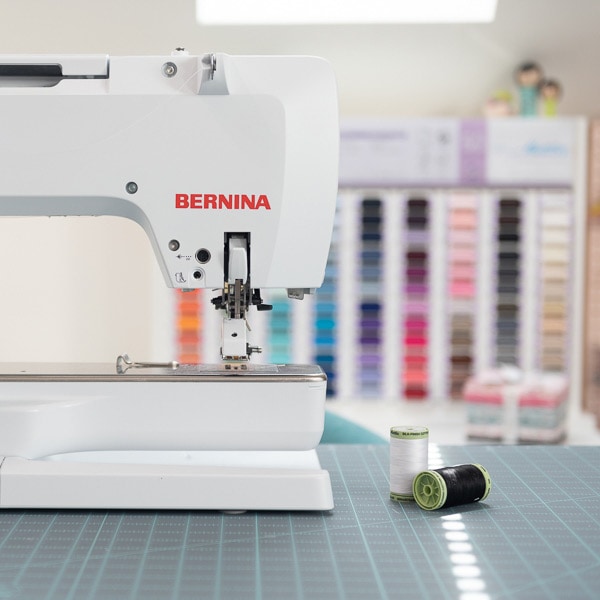
From scissors and fabric to glue and ribbon, these are the supplies I reach for over and over again!


Browse by Project:
As seen in:


Meet the author
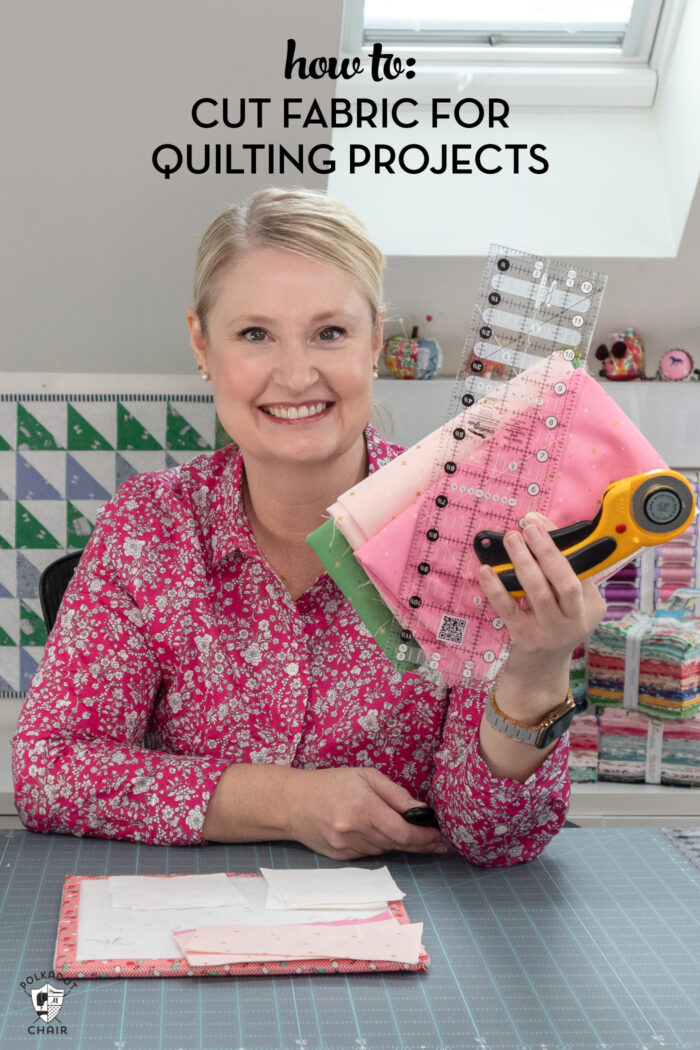
Welcome! I’m Melissa!
It’s nice to meet you! I’m Melissa Mortenson, a blogger, published author & licensed fabric designer.
I’m also a Mom and a Maker. I am like most of you, just trying to do my best every day. I find joy in creating, if you do too, then I hope that you find something here to bring a little “happy” to your life.